
Cinematic Color Grading Explained: A Complete Guide
Every great movie has a certain look that makes you feel something before a single line of dialogue is spoken. That look is rarely an accident — it's the result of cinematic color grading, a craft that shapes mood, story, and emotion through color.
Whether you're a beginner editing your first short film or a professional working on commercial projects, understanding how color grading works will change the way you watch and create videos. Of course, it takes practice to truly master, but once you understand the fundamentals, you'll start to notice how filmmakers use color as a storytelling tool in almost every scene.
In this guide, we'll walk through the difference between correction and grading, the tools of the trade, and the path to a truly cinematic look for your own footage.
What Is Cinematic Color Grading?
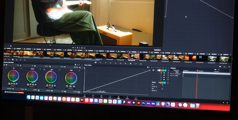
Cinematic color grading is the post-production technique of adjusting color to shape a movie's tone, direct viewer attention, and deliver a polished, professional look. It moves past simple color correction, transforming raw footage into a unified, compelling artistic visual story through contrast, saturation, and curated palettes.
What Is the Difference Between Color Correction and Color Grading?
This is one of the most common questions beginners ask, and the difference matters more than people realize. Color correction is the technical first step: fixing white balance, exposure, and contrast so that footage looks natural and consistent across every shot, regardless of camera or location. If your camera captured a scene with a slight orange tint under tungsten lighting, correction is what brings the image back to a neutral, accurate sense of reality. Correction is largely about fixing problems rather than adding style — it's the foundation everything else is built on.
Color grading, on the other hand, is the creative stage that comes after correction. This is where you define the mood of your film, push shadows and highlights in a stylistic direction, and build a color palette that supports the story you're telling. A cold, desaturated palette might suit a thriller, while warm oranges and soft skin tones might suit a romantic drama. For example, a horror movie might crush the shadows and drain saturation to create dread, while a coming-of-age film might lean into warm, glowing highlights to feel nostalgic.
In short, correction fixes footage, and grading gives it a vision.
What Should I Do First?
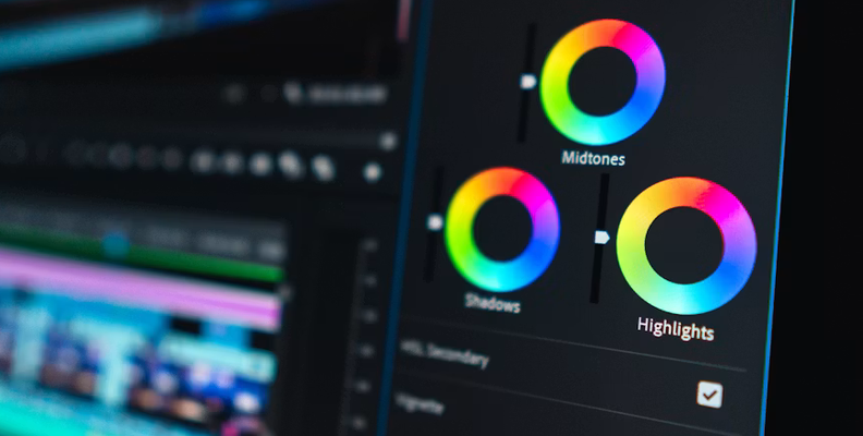
Before you touch any grading tools, make sure you have good footage to work with. No amount of grading magic can save poorly exposed, or badly white-balanced footage — garbage in, garbage out. Shoot with a wide dynamic range whenever possible, so you retain detail in both shadows and highlights, giving yourself more room to adjust later without the image falling apart.
Once you're in post, always correct before you grade. Match shots from the same scene so that skin tones and different colors stay consistent from one camera angle to the next, even if the shots were filmed at a different time of day or in a different location. Only after your footage is corrected and matched should you move into the intense, creative work of grading. Skipping this step is a common beginner mistake that can detract from an otherwise well-shot scene, and it often means redoing work later, which only adds to how time-consuming the whole process becomes.
It also helps to have a clear plan before you start. Sketch out a mood board, gather reference images, and decide early on what kind of feeling you're aiming to create. This bit of preparation saves an enormous amount of time once you sit down to actually grade the project.
Different Types Of Color Grading In Film
There isn't just one way to achieve a cinematic look — the industry uses several distinct styles depending on the story and genre:
- Naturalistic grading: Subtle adjustments that enhance the image without calling attention to themselves. This is common in dramas where realism matters more than intensity, and where the goal is simply to make good footage feel polished.
- Teal and orange: A hugely popular look in modern movies, pushing skin tones toward orange while shadows lean teal. It creates a vibrant, high-contrast image that has become a signature of the blockbuster world, and it's one of the easiest looks for beginners to try first.
- Desaturated/gritty: Often used in war films or thrillers, this style pulls saturation down to create tension and a harder, colder mood on screen.
- High-contrast noir: Deep shadows, sharp highlights, and a moody, dramatic sense of shape and shadow, borrowed from classic film noir.
- Pastel/dreamlike: Soft, low-contrast color palettes often used in coming-of-age stories or fantasy sequences, where the goal is a gentler, dreamier feel rather than intensity.
Think of these as different brushes in your creative toolkit — a bit like painting, where the same scene can carry a completely different feeling depending on your choices. Studying films you admire, shot by shot, is one of the best ways to internalize these styles before applying them to your own projects.
None of these styles is inherently better than another; the right choice always comes back to the story you're trying to tell. A comedy graded like a gritty war film would feel jarring, and a thriller graded with soft pastel tones would lose all of its tension. Part of the fun of this craft is realizing that the same raw clip can become several completely different pieces of work depending on the creativity you bring to the grading stage, so don't be afraid to experiment with a few different looks before settling on one.
How to Apply Color Grading
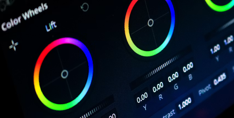
Applying color grading is part science, part art, and it does take practice to craft well. Here's a general path professionals follow:
- Start with correction. Fix exposure, white balance, and contrast so your footage is balanced and every shot matches, no matter where or when it was filmed.
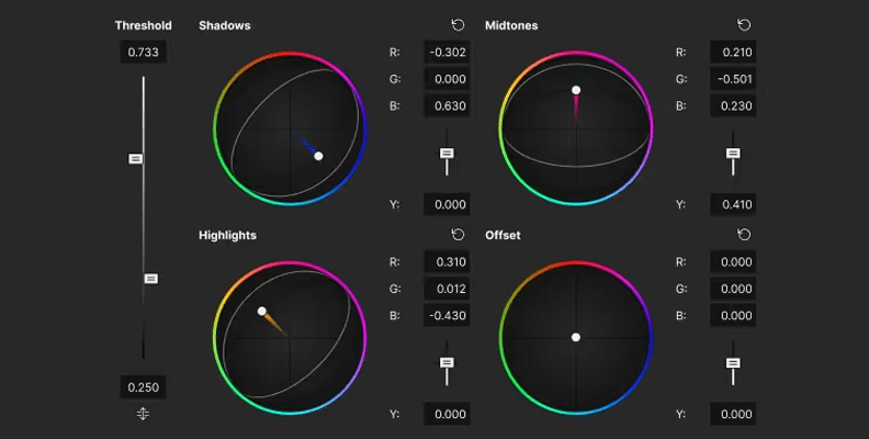
- Build your primary look. Adjust shadows, midtones, and highlights to define the overall tone of your color palette. This is where the cinematic look really starts to take shape.
- Add secondary grades. Isolate specific colors — like skin — and adjust them so skin tones stay natural even as the rest of the image shifts toward a bolder palette.
- Match shots. Make sure every shot in a scene feels consistent, so viewers stay immersed in the story instead of noticing the cuts between different cameras or locations.
- Add finishing touches. Vignettes, grain, or subtle glow can enhance the cinematic feel without becoming distracting or overly intense.
- Step back and review. Watch the full sequence, not just individual shots, since a grade that looks great in isolation can feel wrong once it's cut together with the rest of the film.
This process can be time-consuming, especially on longer projects, but it's often where a project truly becomes a movie rather than just raw footage. Watch how your favorite filmmakers approach a scene and try to reverse-engineer their choices — it's one of the fastest ways to build your own sense of style. Many editors also take an online course or follow along with tutorials to speed up the learning curve, since seeing an experienced colorist work through real footage teaches lessons that are hard to pick up on your own.
It also helps to save your favorite grades as presets or LUTs once you're happy with them. This way, you can use a consistent starting point for new projects and adjust from there, rather than rebuilding a look from scratch every single time. Over time, you'll build a personal library of looks that reflect your own taste, and reaching for the right one will become second nature rather than a fresh guessing game on every shoot.
Software For Color Grading
You don't need Hollywood-level tools to start grading, but choosing the right software does matter, and each option below brings its own strengths to different kinds of projects.
Vegas Pro

Vegas Pro is a long-running Windows editor that keeps grading in the same timeline you cut on, so you never have to move a project between applications. Its Color Grading panel covers the essentials — color wheels, curves, HSL adjustments, LUT import and export, and scopes — with ACES support and GPU-accelerated playback in recent versions, so adjustments update as you make them. It's fast to learn and a solid fit for solo creators and small teams who want editing, grading, and audio in one place.
Boris FX Continuum & Sapphire

Boris FX offers some of the most powerful grading tools and plugins in the industry, giving editors advanced control over color, light, and texture. Their features are used by professionals on real film and TV projects, and the plugins integrate directly into Avid Media Composer, Premiere Pro, After Effects, and other major editing platforms — a great option for anyone aiming to push their grading further and add a more intense, stylized layer to their work.
DaVinci Resolve Studio

DaVinci Resolve Studio is considered the industry standard for color grading. Its node-based system gives you precise control over every part of the image, and countless YouTube tutorials can help beginners learn its Color page step by step. Many professional colorists use it exclusively on major film and commercial projects.
Final Words
Cinematic color grading is a craft worth taking seriously, whether you're working on personal projects or professional productions. It takes time, a trained eye, and a willingness to experiment with ideas until you find a look that fits your story. Every frame deserves the same care you gave the shot on set — good grading can turn ordinary footage into something that feels like a real movie on the screen, wherever in the world it was filmed.
If you're just starting out, don't feel intimidated. Watch tutorials, study your favorite films, and practice on your own footage until you develop your own creative sign-off style. We hope this guide gives you a clearer sense of where to begin and the confidence to realize your own creative vision.
At the end of the day, color grading is one of the last steps standing between a rough cut and a finished piece that truly belongs on the big screen. It's easy to underestimate just how much a thoughtful grade can shape the way an audience feels about a story, but once you start paying attention, you'll see its fingerprints on nearly every movie, commercial, and music video you watch. Keep experimenting, keep watching how the professionals do it, and don't be afraid to push a look further than feels comfortable at first — some of the best cinematic looks come from happy accidents discovered while adjusting a slider just a little too far.
FAQ
Do professional filmmakers use LUTs?
Yes — professional filmmakers use LUTs (Look-Up Tables) regularly, but usually as a starting point rather than a finished result. On set, cinematographers often apply a LUT to camera monitors just to preview roughly how a shot will look once graded, since raw log or flat footage can be hard to judge by eye. In post, colorists commonly load a LUT as a base layer — sometimes a standard one to convert log footage to a normal color space, other times a creative LUT to establish an initial mood — and then fine-tune from there with manual grading (adjusting shadows, highlights, skin tones, and saturation shot by shot).