
Get Started with Teal and Orange Color Grading in Vegas Pro
You've probably seen this look a thousand times without ever naming it. A character stands in a dim street, skin glowing warm, while everything behind them drifts into cool blue-green. That is teal and orange grading, and it has been the house palette of mainstream film for the better part of two decades. It turns up in music videos, car commercials, travel vlogs, and plenty of wedding films too. The good news is you don't need a colorist on payroll. This article is for both experienced and beginner editors, and it covers what the style actually does to an image, why it flatters skin so well, and how to achieve it yourself in Vegas Pro.
So, without further ado, let's get straight into it.
What Is Teal and Orange Color Grading
Teal and orange color grading is a widely used look that pulls shadows and cooler areas toward blue-green teal while nudging highlights and skin tones into warm orange. The resulting complementary color contrast separates people from their surroundings, echoing real lighting conditions such as a warm sunset set against a cool sky.
The idea rests on the color wheel. Teal and orange sit almost directly across from each other, which makes them complementary colors, and complementary colors always read as the strongest possible color contrast the eye can register. Human skin happens to fall in the orange half of that wheel, somewhere between red and yellow depending on the person. Push the rest of the frame the other way, and faces separate from the background without any extra lighting. Colorists rarely paint the whole picture in two hues.
In practice, the shift is small. Shadows lean teal, highlights lean warm, and the midtones where skin lives are protected so the tone still appears natural. Overcook any of those three and the result stops looking cinematic and starts looking broken.
Why Use Teal and Orange Color Grading
The first reason is separation. A subject shot against a busy background can get lost, and the orange-teal split gives you a striking contrast that makes the person pop without a rim light. Photography has leaned on the same trick for years.
The second reason is familiarity. Audiences have been trained by two decades of blockbusters, music videos, and game trailers to read this palette as expensive. Fair or not, a slightly graded shot reads as more deliberate than a flat one straight from the camera.
The third reason is rescue work. Footage shot under mixed or muted lighting often has no real color identity. A defined combination can enhance flat footage and give the scenes a point of view they never had on set.
It isn't a universal answer. A period drama, a moody horror short, or anything built on green and earth tones will fight the look rather than benefit from it.
Teal and Orange Color Grading in Vegas Pro: Step by Step

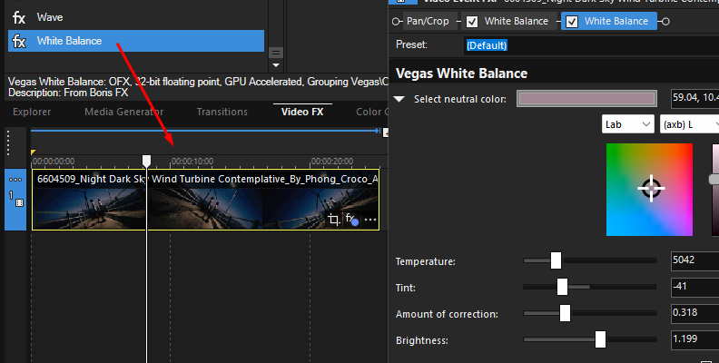
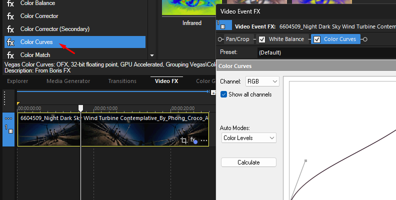
The process starts with color correction, not grading. Drop your clip on the timeline, open the Video FX tab, and apply White Balance if the shot has a cast. Then, use the Levels or Color Curves plugin to set your black and white points.
Next, add the Color Grading plugin from the Video FX list. This is the main color grading tool in Vegas Pro, and it gives you three wheels labeled Lift, Gamma, and Gain, which control shadows, midtones, and highlights in that order.
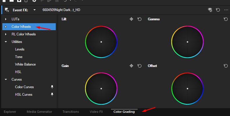
Now apply teal to the shadows. Drag the Lift wheel handle a short distance toward the blue-green quarter of the wheel, keeping it close to the center, since you want teal tones in the darker parts of the frame and not a blue wash. Then drag the Gain handle toward the warm side to create a cinematic orange in the highlights. If the picture starts to look like a filter, you have gone too far.
Leave Gamma mostly alone at first. Midtones carry most of the skin information, and dragging that wheel is the fastest way to make faces look unnatural. If skin has picked up a teal cast anyway, nudge Gamma very slightly toward orange to bring it back.
Two sliders shape how those ranges meet. Blend sets the overlap between the color wheels, and Balance moves the midtone boundaries, which changes how much of the picture Gamma affects. Nudge Balance if teal is creeping into faces instead of staying in the shadows.
For finer control, apply the Secondary Color Corrector and use its eyedropper to select the skin range, or use HSL adjustments to isolate skin by hue, saturation, and luminance. Either way, protecting skin lets the rest of the frame take the full grade, and that step separates a decent grade from a rough one.
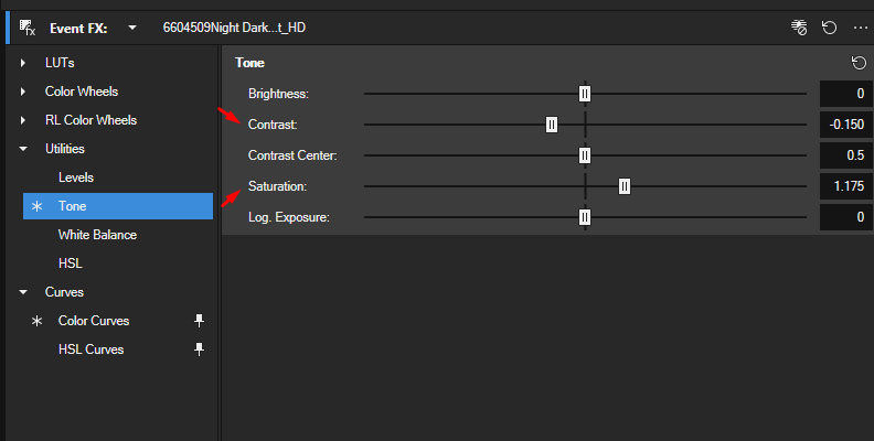
Finish with saturation and contrast. Raise contrast a touch to deepen the shadows, then check saturation, since a graded clip often looks more saturated than it is. If one channel still reads too strong, curve adjustments in Color Curves refine how the colors present more precisely than the wheels can.
Toggle the FX on and off to compare. The version you keep should still look like the scene, only better.
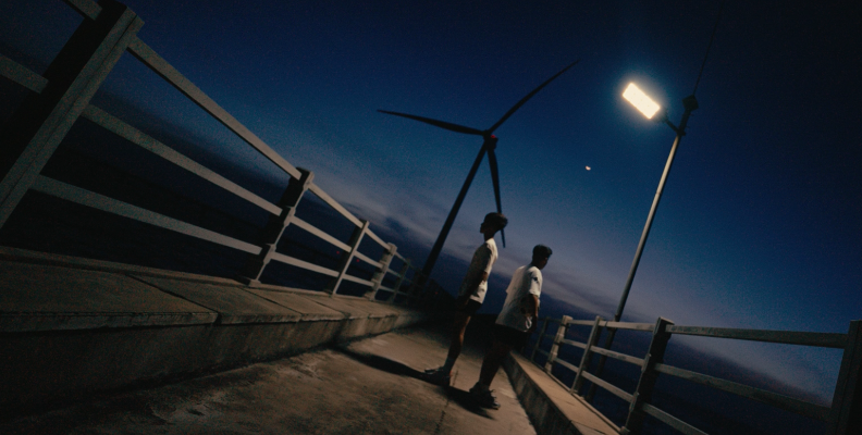
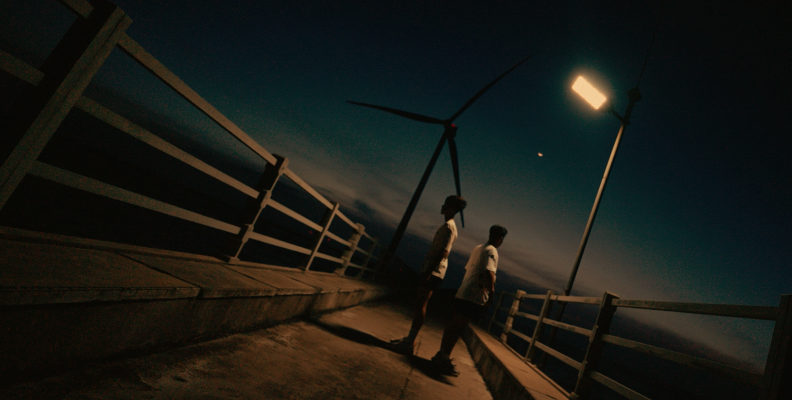
Using LUTs for Teal and Orange Color Grading
A LUT is a preset file that remaps specific colors in your footage to new values. Free teal and orange LUTS are available online in .look and .cube file formats. Vegas Pro reads them through the LUT Filter plugin, which takes .cube files.
Load one and the whole orange and teal shift happens in a single click. That speed is the appeal, and it is also the trap. A LUT was built for a particular camera, a particular exposure, and a particular white balance. Drop it on footage that doesn't match, and it will do strange things, most often to skin, which can drift toward purple or yellow before you notice.
Treat the LUT as a starting point rather than a finished grade. Correct your clip first so it sits close to neutral, apply the LUT, then finish by adjusting the plugin strength until the effect sits where you want it. Half strength is often closer to the desired look than full.
After that, go back and fix what the LUT broke. Skin tones almost always need a small pass, and greens in a background often need to be pulled back.
Final Words
Teal and orange work because it is built on a real relationship between complementary colors, not because it is trendy. The technique is simple enough to learn in an afternoon, but also easy enough to overdo in about the same time. Keep the shift subtle, protect the skin, and judge every grade against the ungraded version rather than against a still from a film with a bigger budget.
Try it on a few different clips before you commit to it as your style. Some footage takes the artistic push beautifully, and some doesn't, and the only way to find out is to grade it and look.
FAQ
This section contains some of the most frequently asked questions and answers on this topic.
Why is teal and orange so popular in movies?
Two reasons, one practical and one historical. Skin sits in the warm range, so pushing everything else cool is the cheapest way to separate actors from a background across an entire film. Teal and orange also boost energy in visual storytelling. The habit spread once digital grading became standard in the early 2000s, since the shift could be applied to whole scenes in post rather than lit on set. After enough hit films used it, the palette started to read as the default cinematic look, and shots that lack it can appear flat by comparison.
Do I need an expensive camera to get the look?
No. The majority of the work happens after the shoot, and any camera that records a clean image will hold a grade. What matters more is exposure and white balance on the day, because a badly exposed clip falls apart the moment you alter its hue and balance in post. Shooting flat or in log gives you more room, though it isn't required for this style.