Far too often you’ll see or hear the terms “color correction” and “color grading” used interchangeably. More often than not, you’ll see “color correction” used when they really mean color grading, and sometimes you’ll see it the other way around.
What’s the difference? Simply put, color correction is correcting problems, while color grading is adjusting color and contrast to serve an artistic choice.
What follows is a guide on the difference between color correction and color grading, and some typical best practices for both.
In order to understand the process of color correction and color grading, it’s important to get a basic grounding in some of the terms and concepts and a quick understanding of some of the tools of the trade. Keep these terms in mind as we move on to the process of color correction and color grading.
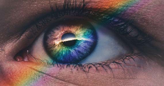
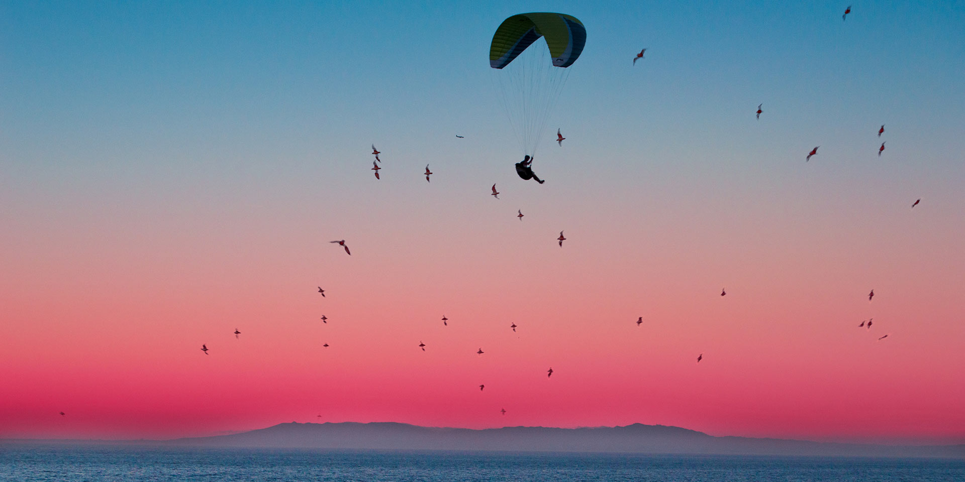
It might seem strange to ask what color is; everyone knows that, right? Sort of. We live with color every day, but we don’t often consider what it really is or how it works. Color is simply the brain’s interpretation of different wavelengths of visible light. Color doesn’t really exist outside our brains. It’s just our way of making sense of the light information which comes into our eyes. But because we interpret light that way, we see many, often beautiful, distinctions in the world – the green of grass, the blue of a clear summer sky, the rainbow colors on a parrot, and millions of other things.
We’ve grown to associate different colors with different moods or feelings, often because nature has condition+ed us that way. We usually think of blue tones as cold or cool, and red-orange tones as warm or hot. We associate blue light with nighttime and bright colors with daytime. Yet we find scenery bathed in green or purple light or tints strange and otherworldly because we don’t generally see that from natural lighting.
The upshot is that imagery with colors which seem “off” can be jarring and unnatural. Often it needs fixing, and that’s where color correction comes in. But sometimes it’s exactly what you want, to convey feeling, mood, or atmosphere, serving your artistic purposes, and that’s what color grading does for you.
Video color is a mixture of the three primary colors of light: red, green, and blue. So, video color is known generally as “RGB.” Different combinations or numerical values of these three colors produce different colors, or hues. Mixing colors produces more colors – adding blue to red creates purple, or adding red to green creates yellow. Adding all three primary colors creates many different colors depending on how much of each is added or subtracted.
There’s a regular pattern to colored light and how they mix, best represented on a circle or wheel. Every color is represented on the wheel in a specific order, from red to orange to yellow to green to cyan to blue to purple to magenta, and then back to red. This means certain colors have opposites, the colors directly across from each other on the color wheel. This placement is useful, and we’ll explore that in a bit.
Basically, a color – red, orange, yellow, green, etc. – is a hue. But there’s more to color than just the color itself. There are also many different shades of colors, darker or brighter versions of that color. While the hue is the basic color, saturation and luminance determine the shade of that color.
Think of saturation as how much gray is in a color. A highly-saturated color has a lot of pure color in it, and very little gray. The more gray, the less color. A color with less gray and m more color is more saturated and the color looks more vibrant, even bordering on cartoonish when very highly saturated.
Luminance is how bright a color is, or the amount of white or black in a color. A color with more black added to it appears much darker; a color with more white appears much brighter.
A color with high saturation and high luminance appears very, very bright. A color with low saturation and low luminance appears very close to black. But a color with high luminance and low saturation appears very close to white. A color with high saturation and low luminance appears as a very dark shade of the color.
Adjusting hue, saturation, and luminance can produce any possible color. Most color correction tools include “HSL” sliders for doing exactly that.
The dynamic range of an image is how much detail you can see in the darkest darks and in the brightest brights, and how far apart those points are. It’s measured in stops, each stop being twice as bright as the next lowest stop. Early digital video cameras had very limited ranges, of 4-5 stops or less. Film cameras and modern digital video cameras can have 13, 14, 15 stops or even more of range.
High Dynamic Range (HDR) is a relatively new process in video which extends the range even further, giving you visible detail in the darkest shadows but also in the brightest brights, bringing video images closer than ever to what the human eye can see.
Modern color correction and color grading includes tools and monitors which allow you to work in and deliver these very high dynamic range images.
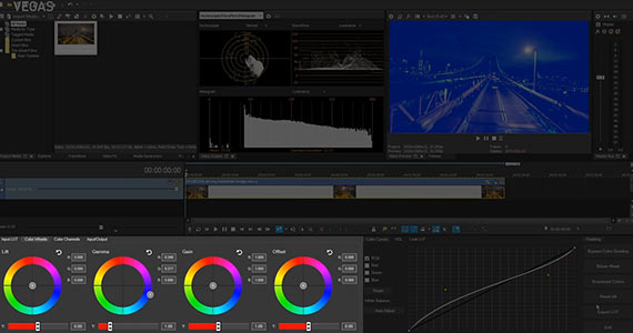
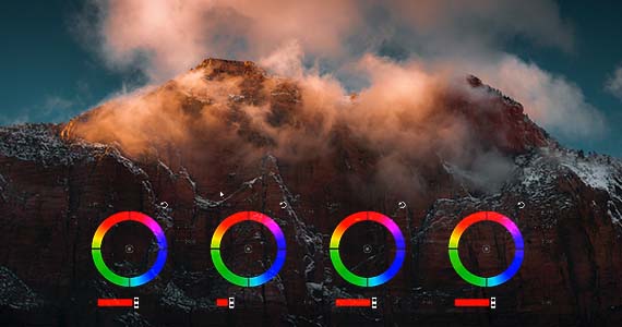
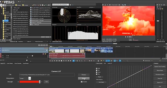
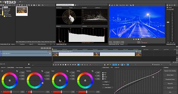
Color wheels are some of the most basic color correction controls. They represent the color spectrum on a circle and let you adjust color in the 2D space of the wheel. They start out with a movable dot in the center of the wheel. Dragging the dot toward a color area adjusts the color of the image in that direction. The angle at which you drag determines the color(s) you adjust, so dragging the dot into the red-orange area makes the overall color more red-orange. The further away from the center of the wheel you drag, the more you increase the saturation of the color you’re dragging toward.
But you can also say that you’re moving the dot away from the opposite color on the wheel. So, if you have an image that’s predominately blue, dragging the dot away from the blue area reduces the amount of blue in the image.
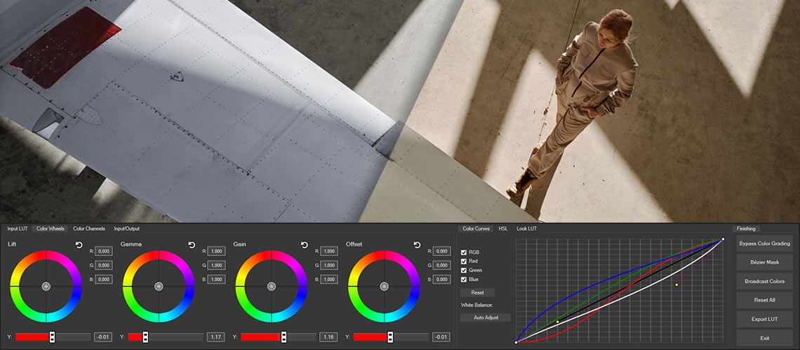
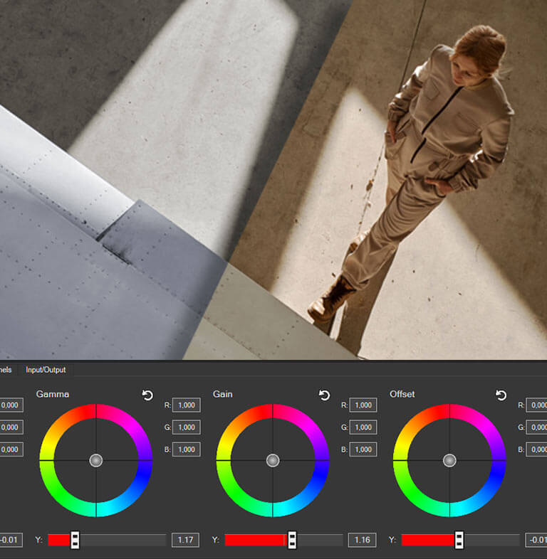
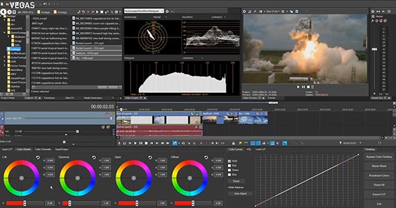
Color wheels usually come in sets of three or four wheels. One wheel controls the darkest parts of the image, the Lift; one controls the middle part of the image, the Gamma; the third controls the brightest parts of the image, the Gain. Sometimes there’s a fourth wheel, which controls all areas of the picture at once, usually known as Offset.
Color wheels often include a slider to control the brightness, either as a dial around the edge of the wheel or as a straight slider underneath it. “Y” represents this value.
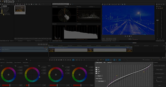
Color curves let you take very precise control of the brightness of an image. Not just a slider which controls the overall brightness, the curve lets you manipulate very precise areas of brightness or darkness. If you want to simply brighten up the darkest shadows, you can. If you want to leave shadows and highlights where they are and brighten or darken the mid-range, you can. You can do this at whatever level of precision you want. You can add control points along the curve to manipulate separate sections of the curve.
Most color curve tools allow you not only to control the overall brightness of the image, but also each individual RGB channel, so you can darken or brighten individual colors as you see fit. If you want to remove blue from an image or punch up yellow, you can lower the blue curve. Or, you can increase the red and green curves together. Color curves often make for excellent and precise white balance correction, contrast control, and you can use them creatively to make all kinds of wild color effects.
Color sliders let you manipulate the red, green, blue, and brightness values directly. You can control exactly how much of each you want in the image, and usually broken down to the same Lift, Gamma, Gain, and Offset divisions as color wheels. It’s a slightly different way of accomplishing the same task as a color wheel, only with the color components better isolated.
For any color work, it’s extremely important to view it on a reliable screen showing you true colors and brightness levels. As such, it’s always best to work on a professional monitor and calibrate it often. You want to know you’re seeing the true picture at all times.
Professional monitors often run very expensive and out of reach of non-professionals or small production companies, but at least be sure to keep the monitor you do work on as calibrated as possible. Learn to use color bars, brightness porches, and other calibration tools, and make sure your monitor stays as close to true, professional color as possible.
In the same vein, when doing color work, don’t rely on your eyes. It’s a bit counter-intuitive, because color correction is about getting the image as close to the natural appearance of the human eye as possible, but as professional tools assessing color, your eyes aren’t very dependable, especially when it comes to assessing brightness and darkness. Your brain is very forgiving and adjusts its perceptions to what it knows the image “should” look like, so you may not see problems. Similarly, as stated above, your monitor might not show you the true picture, either.
But video scopes always will, which is why they’re indispensable tools when it comes to color correction and grading.
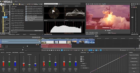
The Vectorscope shows you the color in your image spread out over the color wheel. The closer a color appears to the outer edge of the scope, the brighter the color is. The Vectorscope also tells you at a glance what the predominate colors in the image are. If all of the plots bunch up in the blue area of the wheel, then your image’s color is largely blue, making it easy to tell if perhaps your color is unbalanced toward the blue – even if your eyes can’t see it or the monitor doesn’t show it.
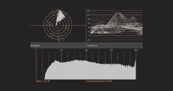
The Waveform measures all of the brightness levels of everything in the image, from right to left, making it your go-to scope for adjusting exposure and contrast. A well-exposed image should produce a robust, well-distributed brightness plot on the Waveform, from the top of the range all the way to the bottom. An image where the Waveform is bunched toward the bottom may be too dark, while an image bunch toward the top may be too bright, especially if there are a lot of flat lines at the top. An image where none of the plot goes near the top or the bottom may appear “foggy” with very little contrast.
A variation of the Waveform, sometimes as a setting within the Waveform scope or as a separate scope called the RGB Parade, allows you to see the brightness of each individual RGB color.
Video software often includes a Histogram, which graphs how much of each level of brightness appears in the image. At a glance, if the Histogram plot bunches up to the right, the image may be too bright, and if it’s bunched to the left, the image might be too dark. Unlike the Waveform, though, there’s no spatial relationship between the graph and your image, so its use is limited in video applications.
Color correction is about fixing problems in exposure, contrast, white balance, and overall color to produce a natural, baseline image which matches the eye’s view. Color correction, therefore, is more of a technical process than a creative one. Being a technical process, a fruitful approach often involves a specific order of steps. But keep in mind, every step in the process affects every other step, so you may find yourself going back to adjust earlier corrections as you move through the process.
Modern video formats, especially HDR formats, give you amazing control over the exposure and color in your image while preserving incredible amounts of detail. But there are many different video formats you might work with, and they often require a bit of preparation before you can start your correction. In short, you must tell the software what kind of video it is so that the software knows how to apply its adjustments.
✓ One way to do this is setting the color profile.
The software needs to know If you’re working with RAW or LOG footage, HLG or HDR10 footage, or Rec.709 or Rec.2020. If you work with a certain format yet have the color profile set to a different format, you can get strange and unexpected results.
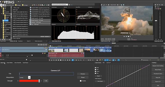
✓ Another way to set up your correction is to apply a Lookup Table (LUT), which is a set of instructions as to how to interpret the color information in the image. The footage from some cameras requires you to apply a specific camera LUT. Some other formats benefit from using a LUT even if not technically required.
As with a color profile, you can apply any LUT to any footage. Or, you can choose not to use one at all. But if the footage you’re using requires a specific LUT and you use a different one or none, you may get strange and unpredictable results.
The first real step of color correction is often setting your exposure correctly. Generally speaking, you want to make sure that everything is at its proper brightness. Often, you can set proper exposure based on people’s faces; if you get that exposure correct, then most of the rest of the image should be close.
You can use many of the tools mentioned above to help with this.
✓ You can use Offset sliders to brighten or darken the whole image, or
✓ You can use Lift, Gamma, and Gain sliders to control the darks, middle, and brights separately.
Human faces are usually in the middle, so if you set that using Offset, you can then use Lift and Gain to control the darker and brighter parts of the image separately.
Or, you can use the precision of the color curves to brighten and darken the exact areas you want.
Use the Waveform to guide you. As we mentioned above, you want a robust distribution of brightness, so use the controls to fill out the whole range of the image. Set your Gain or top part of the color curve so that the brightest parts of the image fall close to the top, and use the Offset or bottom part of the color curve to get your darks to fill out the bottom part of the scope. Adjust Gamma or the middle part of the color curve as necessary to keep your middle set. Once you do, you should have a pretty good exposure.
Exposure affects color, so it’s often best to make sure it’s set before working with color. But the first thing you want to do with color is make sure you have a proper white balance.
A camera’s white balance sets the whites in the image to true white so that all of the colors fall to their correct areas. An improper white balance can shift the colors in the image toward orange or blue, so that whites appear tinted and the other colors are off.
Even a properly set white balance can end up a little off, so you often must tweak it in post.
Here, use the Vectorscope. If the whole image skews toward blue or orange, then the white balance probably needs fixing.
Any combination of the tools can help; choose the tools you prefer. If you use the Offset color wheel and drag the dot, you should see the entire plot on the Vectorscope move in the direction you drag the dot. Sometimes that does the trick, but more often, you’ll need to adjust the areas individually.
As always, the color curves are your most precise tool. You can add or remove colors as needed to get your whites to pure white and your other colors adjusted accordingly.
Most software, and some color wheels, have automatic white balance adjustment tools. These can do the bulk of the work, but usually you’ll still need to adjust manually to really dial in the perfect white balance.
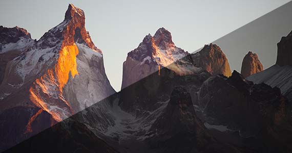
With exposure and white balance set, now’s the time for adjusting contrast, the difference between darks and brights. A high-contrast image appears sharper and more detailed, while a low-contrast image appears foggy or gray.
Adjusting contrast generally comes down to working with the brightest and darkest parts of the image. Increasing Gain and decreasing Offset creates more contrast; the opposite lowers the contrast.
But again, the color curves are your most precise and useful tool, especially as it gives you a graphic representation of the contrast. A color curve shaped like an S, with the lower left flattened downward and the upper right flatted upward, produces pleasing contrast, while the opposite shape – steep slopes on the left and right with a flattened middle – reduces contrast.
Keep an eye on the Waveform. You don’t want to crush your darks into flat lines at the bottom or clip your brights into flat lines at the top; flat lines represent lost detail, and you want to preserve as much detail as possible.
Secondary color corrections lets you adjust individual colors. If you want to make a particular blue object in your image really pop, you can do it. Or, if you want to change an individual color into an entirely different one, you can do that, too. You can also use secondary color correction to even out the hue and brightness of a green screen prior to removing the background with chromakey.
Often this step is a creative one, more akin to color grading, but sometimes single colors end up getting washed out or changed slightly during overall color correction and can benefit from individual attention.
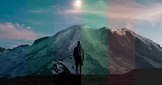
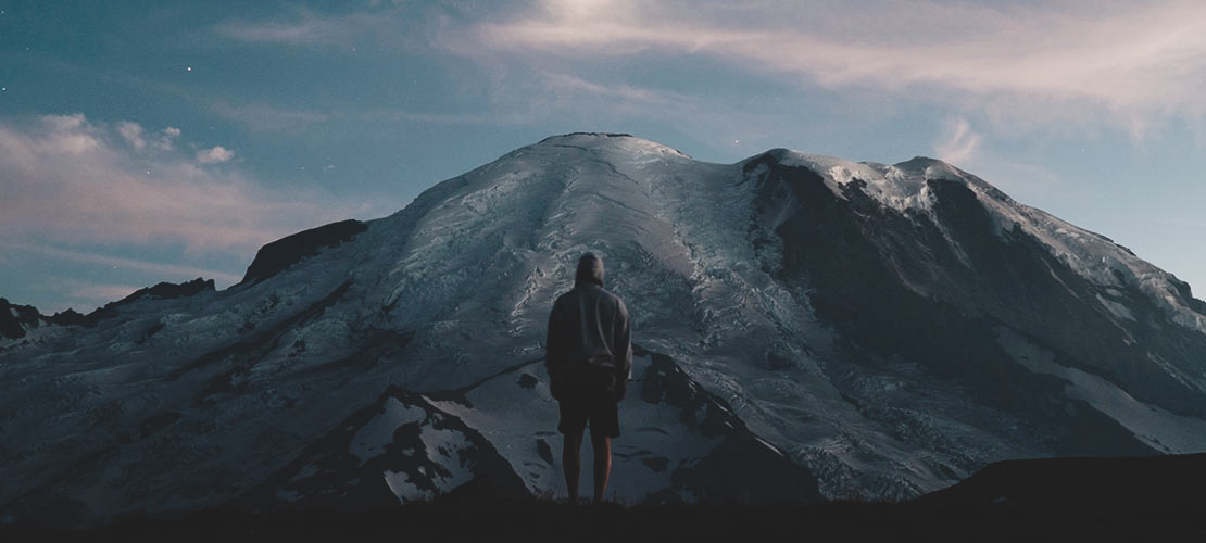
Once you have your baseline image dialed in, you can begin the creative process of color grading. At this point, it’s no longer about fixing problem; color grading is where you make your artistic choices, set your mood, and let color and contrast help establish your world and tell your story.
Useful Tips: A Unified Color Grading Panel for A Powerful Workflow
LUTs can make achieving a powerful color grade simple and easy. Many different sources – camera companies, editing software companies, and many others, offer pre-made LUTs with all kinds of different looks, many based on looks seen in popular movies and TV shows. You can download LUTs or LUT packs -- some free, some paid -- and apply them to your own work.
Many LUTs are based on popular sci-fi worlds like “The Matrix” or on slick action-thrillers with distinctive night themes.
Besides being quick and easy to apply, you can always tweak, push, and pull your color even further to get the perfect customized look you want. And most pro-level software lets you export your own looks as LUTs for use on other video in your projects, in other projects, or even in other software which uses the same LUT format such as .cube.
You could even create your own LUT packs and sell them!
Keep in mind, though, that LUTs are often geared to specific types of footage. A LUT created for Rec.709 may give you very different results if you apply it to LOG footage, and vice versa. Make sure you use LUTs appropriate to your footage.
That said, certain types of color or contrast schemes convey certain moods. Keep in mind what we said before – our brains interpret light and colors in certain ways because nature has conditioned them to do so. Different colors and lighting schemes signal our brains to mean different things, and we can use that to artistic advantage. A few examples:
✓ A washed-out, desaturated color palette, known as “bleach bypass,” can give an antiquated feel, appropriate for something set in the past, especially if we’re used to seeing that era in black and white.
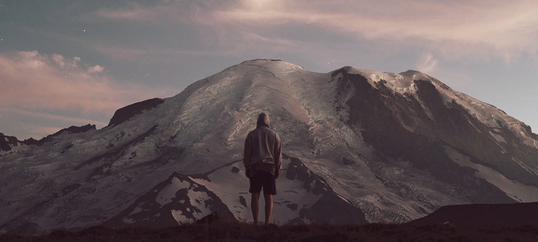
✓ An overall orange tone can give an otherworldly feel, like the orange-pink sky of the planet Mars.
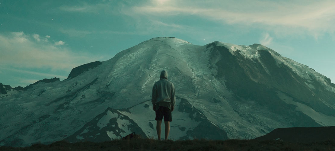
✓ The greenish tint of “The Matrix” worked because it visually linked to the green lettering on computer monitors, giving a feel of being inside the computer.
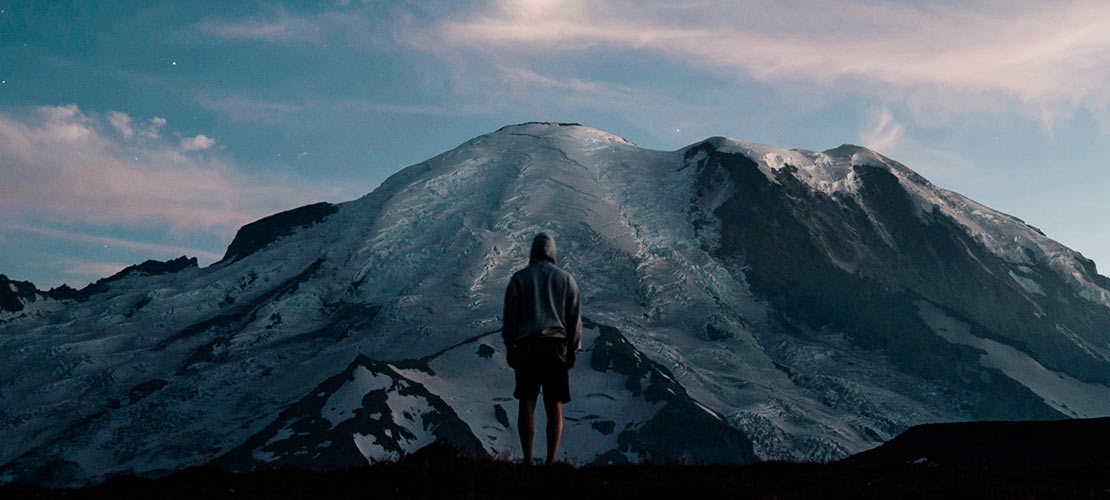
✓ A high-contrast, dark scheme could work for modern-day film-noir style stories.
✓ Blues and dark reds could set an appropriate tone for Gothic horror like vampire stories.
✓ Bright, saturated colors often work for comedies or evoke the four-color feel of comic books for superhero movies, while dark, desaturated colors work for grittier, angst-ridden stories.
Those are only a few examples; the only limits are your imagination. Find the grade and set the tone appropriate for your own stories. Maybe even do it in a way no one’s ever done it before!


What's the difference between VEGAS Pro and VEGAS Pro Suite?